Friday, 18 December 2015
Tuesday, 13 October 2015
Interior Design Project 1: The Playlist
As we were briefed about this project assignment, it was about creating a compact iconic listening booth that suits the mood,music essence and characteristic that best express the sound genres. The main functionof this booth was to create an exciting environment that gives off a better impression and
attracts viewers to experience the space through visual in order to maximize
their audio sensory. The considerations that were looked at was the compactisati in space
design which would cater all the intended activity comfortably within the
limited space.Provided there is also, consideration of behaviour and attitude while listening to
music which includes posture, movement, body language and gesture.
Inspiration:
Inspiration:
Monday, 14 September 2015
Interior Design Project 1 : RYTHM WALL
RHYTHM WALL
Our next Phase 1 Assignment was to construct a RHYTHM WALL according to our given music genres. In which case mine was Electronic Dance Music .
The Rhythm Wall would have to portray and give a best impression about the music genre itself. We were given freedom to design our future wall. However, we were told that keeping designs to a minimal and abstract looking would be more interesting . As for the materials, we were given enough freedom to use whatever we liked as long as they were white in colour or colourless. However , Ms Norgi did advice us to use minimal materials as we have yet to look into what materials were suitable for which designs.
The Rhythm Wall would have to portray and give a best impression about the music genre itself. We were given freedom to design our future wall. However, we were told that keeping designs to a minimal and abstract looking would be more interesting . As for the materials, we were given enough freedom to use whatever we liked as long as they were white in colour or colourless. However , Ms Norgi did advice us to use minimal materials as we have yet to look into what materials were suitable for which designs.
UNLEASH THE BEAST
Electronic Dance Music has now become one of the most mainstream music of the generation. It is know that EDM represents up beat music, with high low tempos,fast tracks and repetition.
I was influenced by the movement of the music itself. Whenever I envision EDM , I began to picture a ball of energy. Pumping , blasting and full of movement. Unleash the Beast , represents the music strongly. It is where in EDM that people lose their self consciousness and completely surrender themselves to the music.In an abstract way, the strange shape shows how from the center ,the ball of energy slowly becomes a whole, creating its own aura and effects peoples mood .
Process :


Front of wall
Monday, 7 September 2015
Interior Design Project 1: Electronic Dance Music Infographic Board
For our first particular assignment, we were all required to work in groups of five.Of course our lectures decided to spice things up by handing out lucky draws to see which category we'd fall into.
There are a few different music genres that were given off such as Soft Rock, Hard Rock, Retro, Reggae and so on. I ended up being placed in Electronic Dance Music and was paired up with Zack, SQ, Wen Wei and Carmen as my group members.
We started of doing in depth research on Electronic Dance Music and what the sub genre's were. We were also lucky enough that Zack was knew more about this topic since he himself is a DJ :p and had help us.
Like any other group,we manage to split the task so everyone would have a part to contribute.
Not only that, we also had bonus materials to support our Infographic Board which was an actual DJ Deck. Courtesy of Zack of course. We had it plugged into our Mac and play different sub genres of EDM. Everyone seemed to have loved it . In fact, it made people more aware of the difference of EDM a lot better.
All and all my team mates and I had done a fantastic job, we work hard in producing the final outcome :)

Reflection / Comments :
As for the criticism from our lecturers , we were told that we had so far grasped the idea of what and info board really is and that we had implemeted and translated most of our finding into pictures and images rather then to write them out. However, Ms Shaa and Ms Norji found that it was too "much". In a sense, they mentioned that there were to many elements going on such as the shapes. We had circles , rectangles, triangles and others that it was getting a bit scattered. In the end, I do agree that perhaps keeping within a specific "theme" would have been a lot better. But whats done is done and shall I make the most of what I've learnt.
There are a few different music genres that were given off such as Soft Rock, Hard Rock, Retro, Reggae and so on. I ended up being placed in Electronic Dance Music and was paired up with Zack, SQ, Wen Wei and Carmen as my group members.
We started of doing in depth research on Electronic Dance Music and what the sub genre's were. We were also lucky enough that Zack was knew more about this topic since he himself is a DJ :p and had help us.
Like any other group,we manage to split the task so everyone would have a part to contribute.
Not only that, we also had bonus materials to support our Infographic Board which was an actual DJ Deck. Courtesy of Zack of course. We had it plugged into our Mac and play different sub genres of EDM. Everyone seemed to have loved it . In fact, it made people more aware of the difference of EDM a lot better.
All and all my team mates and I had done a fantastic job, we work hard in producing the final outcome :)

Reflection / Comments :
As for the criticism from our lecturers , we were told that we had so far grasped the idea of what and info board really is and that we had implemeted and translated most of our finding into pictures and images rather then to write them out. However, Ms Shaa and Ms Norji found that it was too "much". In a sense, they mentioned that there were to many elements going on such as the shapes. We had circles , rectangles, triangles and others that it was getting a bit scattered. In the end, I do agree that perhaps keeping within a specific "theme" would have been a lot better. But whats done is done and shall I make the most of what I've learnt.
Monday, 6 July 2015
Submission for Intro to Interior Architecture Projects Final POD
Today was our final submission / presentation for our Into to Interior Architecture Project class.A day before we we're asked to set up our final work including our portfolios as well as our models. We we're then evaluated by different lecturers with a Design background.
Here are some of the photos on how the presentation went :
Here are some of the photos on how the presentation went :
Story Board
My weapon
Final Pod
Functional Machine
- From our previous assignment
Wednesday, 1 July 2015
Tuesday, 30 June 2015
Sunday, 28 June 2015
Sketching-Live Drawing "Exploring Details"
After the water colour demonstration that Mr Redzwan had shown, we were all given a task to explore our own creativity and watercolour skills.This was the result.
Saturday, 27 June 2015
Sketchnote Interior Physical Components - Fill in the space
We were given a diagram of a One point perspective drawing and was then later asked to fill it in with human figures and objects.There was endless possibilities when it came to filling in the empty drawing spaces.I decided to keep it simple and drew random human figures here and there according to eve level and size.
Rendering Perspective (Watercolour)
An overview of the busy roads in a small town
Reflection :
In the picture, the painting looks very much dull. I've came to realise that this water colour rendering was to simple. When Miss said that we should control the amount of colour used in a picture, I made some research and most of these watercolour paintings were simple,basic and left a lot of white spaces unfilled.As Mr Redzwan had said less is more and so that was what I did exactly,to be honest I quite liked my rendering, there wasn't to much colour to distract the soft tone.Tho I admit I could have done better by adding at least a bit more shades into it to make it look a bit more lively. I suppose everyone has their own style and preference when it comes to rendering. This I've realised from looking at my fellow classmates works, I've noticed some of them colour the entire page, crazy colours flying everywhere I'd say but yet they still got similar marks as me.
Monday, 15 June 2015
Perspective drawings
Visual Diary : One - Point Perspective Drawing
CL : Purple
VP :Orange
EL/HL : Green
GL : Pink
CL : Purple
VP :Orange
EL/HL : Green
GL : Pink
CL : Purple
VP :Orange
EL/HL : Green
GL : Pink
An extra / redo that I did since the picture quality wasn't showing off to well .
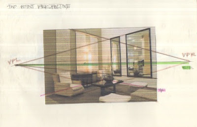
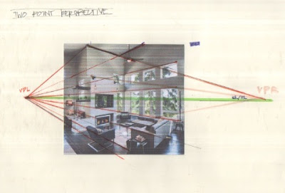
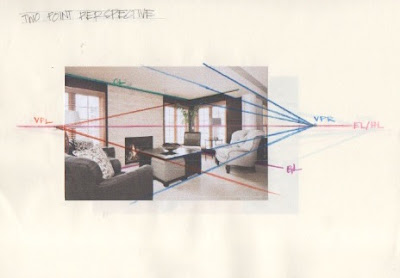
Two - Point Perspective Drawing
VP :Orange
EL/HL : Green
GL : Pink
An extra / redo that I did since the picture quality wasn't showing off to well .
Reflection :
So far I've learnt a lot about perspective drawing during my foundation years. Recalling back I knew it was an important for a designer to know basic perspective in order to create more depth and dimension in their drawings. This time around Miss Norji and Miss Rafidah have thought me more in depth as to what these points and angles are called.
Subscribe to:
Comments (Atom)


