Showing posts with label 2ddesign. Show all posts

Monday, 5 January 2015

Assignment 5 : Paint to music

Assignment 5 : Paint to music

Today we had done our final assignment on the spot.Although I thought it was impossible since we only have just a few hours left till class was over Ms Lisa still insisted on finishing it up today.We were given 2 hours to paint on 2 A1 sized watercolour papers.Each paper we would have to listen to a prepared playlist and paint for an hour.


For the first attempt I painted to the playlist which was created by the class. Most of the songs were upbeat ,some were melodious .The staring process took a while for me,I needed to calm myself and relax.I had no idea what to paint what soever,which colours to choose and which methods I would use.I took a bold step and just decided on a colour and begin spreading ‘Ultra Marine ‘ on paper.As time passed and the music changes I finally got the rhythm,I started off painting with less “force” if that makes sense.I used pinks,purples,orange and  anything I could get my hands on and just blended the colours in.Towards the end of the songs I felt like my painting took a toll of galaxies and I suppose I was going for a gloomy space effect.I blended it some more,the far off brighter colours I felt represent hope .In a way,even if your stuck out in a  gloomy space there could still be hope.


The second piece was done by listening to Ms Lisa’s classical playlist.Me and Serra joked about it being a Barbie themed song :p .Whiles it did reminded me of joyous melodious songs I begin painting soft wave strokes using a turquoise colour .Towards the middle parts of the playlist, the once melodious songs seemed more darker with sharper tunes .As I felt so, the song now reminded me of a  song of tragedy ,which made me a little upset.I begin thinking of a story behind the song. I pictured windy days,full of storms and terror, a sailor out lost at sea.Dramatic I know :/    So my once  pink clouded skies with rays of yellow sunlight was  now masked with a more gloomy greenish sky.The colours blended well and so I moved on making my y waves darker ,blending purples into the bed of sea.As things were coming to an end, I realised I got that heart aching feeling.I painted with heavy strokes,got my fingers dirty smudging whites to create highlights. I wanted to give my all and as I did,time was up,it was over. 


Overall it was a fun experience,never have I ever had a painting session that allowed me to be set free,It was amazing not to stress out and think to much of what there was to paint.The atmosphere was perfect,hectic at first but everyone came to ease.It was beautiful to see the sight of everyone painting and doing their own thing.

Sunday, 4 January 2015

Assignment 4 : Monogram

Assignment 4 :Monogram

We finally received our individual assignment from Ms Lisa."MONOGRAMS" she said.On that day itself she  gave us an hours time to visit the library and go  through books related to font art which will help to inspire our latest art piece.With the help of my class mates ,they would each pick out a word that would best describe me .

After scavenging and rampaging through the books sorted out in the library,I begin to see a pattern  I'd much fancy.I realised most of the fonts I had picked out were mainly made out of bold letters.
I guess it was kinda strange,no one knew exactly what I was,silence........   .Finally Ms Lisa broke the silence by describing me as "Vintage". I suppose in a way I am,I love all these old  carnival fonts,vintage logos,bold bright colours to begin with.But the "vintage" she described mostly meant dainty suppled things,airy and free.

Examples of my inspiration :


Whiles doing some research I realised that vintage could mean a lot of things.When I googled modern vintage they were mostly focused on the visuals.

Fast Update :
Unfortunately after I showed Ms Lisa my drafts I had I misunderstood the whole monogram thing.


The rejected monograms I purposed 

 From what I read and understood a monogram is a motif of two or more interwoven letters,typically a person's initials,used to identify a personal possessions or a logo.And apparently  I tried to spell my name out "IMN" instead of my initials which were "IN".Therefore, I then knew what I must do and re-sketch my new ideas.

I extended my research online.There I used mediums like pinterest instagram and of course google .

My newer designs :


Design number 2 was chosen with a bit of an alteration 


 First attempt on the smaller sized stencils, I accidentally cut off the top swirl :/


  Trials


The final products 

Rational :

Since I've done stencilling before it wasn't much of a challenge for me,I mean apart from almost loosing a chunk of meat on my fingers, I survived :) I didn't take as much progression pictures as I wanted too,with my fingers dirtied with paint,I chose to keep my artwork clean.This was an easy process where all I had to do was paste the stencil over my items and either use the spongy dabbing technique with acrylic or use spray paint.However,theres always a but,it was tricky not to get the paint leaking underneath the stencil.I had to secure everything properly.

For the poster noticed that I picked out a simple frame.I did it so that it wouldn't draw to much attention rather then the monogram itself.It was also best to keep thing at a minimal.

I wanted to keep a theme,I knew very well it was best to.I sticked to browns and pastel colours,mostly blues since they are my favourite colour.Overall Im proud that I've made it this far :)


6 items I've used:
-bell jar
-envelope
-cork board
-flower pot
-note book
-coster
 and a drawstring bag

Resources:
1. goodtype -instagram
2. Pinterest


Wednesday, 10 December 2014

Assignment 3 : Batik

2 Dimensional Design
Batik Field Trip

We searched on google on ideas,the thought of birds free flowing came to mind.


  Jadi Batek Gallery 

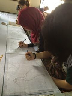
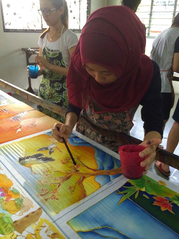
So a few  hours ago my course mates and I were on our way to the batik factory at Jadi Batek Gallery in KL.The bus ride wasn't too long, a lot of us feel pretty sleepy tho since it was only 9am in the morn.Just as soon as we reached there we're the workers that greeted us in.Inside they showed us a brief demo on the techniques they used to hold the tools in order to canting on the fabric itself.After words we were off to pick our own spot.

In that moment everyone just sprawled to find an empty blank canvas to begin their artwork.Most of my group members were close by,Serra being on my left hand side and Yanlin in front of me,unfortunately Seline was blocked by JJ who took the spot next to me,owh well.

Tracing  the design onto the piece of fabric wasn't so bad,however since mine was detailed,with all the bark tress and leaves,it took a longer time.After my back ache from bending down for so long I finally finished tracing majority of the design,I took it upon myself to trust my gut and do the chanting free hand.After all the stupid jokes and laughter,we wasted no more time and decided it was time to chanting.Chanting is know as some sort of candle waxed used in the proses of batik in order to avoid colour spreading all over the cloth .           

Once I’ve gotten the feel of the tool, I said a tiny prayer and begin. Just like how the workers demonstrated,I knew  I couldn't stopped halfway through.And so I practiced on my own,then came the real deal.It started out okay,I must admit it wasn't that hard,right until someone shifts the weight of the fabric.This happened way too many times,it frustrated me even more when horror struck.I was canting my design onto the cloth when suddenly the weight on the fabric cloth shifted and threw my hands off balanced,I ended up spilling most of my candle wax onto my artwork.There laid the blob of wax,by then I was going all sorts of crazy trying to find a way to fix it,with no such luck there wasn't a spot left for me to redo my artwork and so Ms Lisa asked me to continue where I left off,perhaps improvise it later on.Heartbrokenly I continued loosing my passion towards my now spoilt art.


The two ladies helping us out with the boarder.

There I supposed I’ve wasted time,perhaps I was too eger to start painting but the damage has been done,XXXx lost interest in doing it,i felt like it wasn't fair,i didn't get a star over like Mishu or the rest.but time was flying and since time is gold I had to pick myself up.,slowly i begin to proceed an paint,with Serra catching up on me,we’ve decide which colours and tones work well,she and i begin with our mountain,waiting for her to finish with so i could take over,then came the highlights and 


Yanlin busy at work feet.Wafaa


Serra's finished artwork.
Second from the bottom up.


Seline's Batik design 
The base 


Roughly how the designs would look like when pared together .

All and all it was a fun and memorable trip,despite the screams and rush,me and my team mates had enjoyed ever bit of it.Working together picking out which colours would coordinate best.In the end,I would say we did a great job working together.

Saturday, 15 November 2014

Assignment 2: Paper Cutting

17/10/2014 (week 4)
Imani Najwa Binti Nordin (0319405)
Assignment 2 : Paper Cutting

Lecture:
Today Ms Lisa had presented us a small lecture regarding our next assignment which was paper cutting.She had a brief slides to show us.
Brainstorming :


This was one of my first ideas.I've always been grossed out by octopus tentacles but yet somehow  I have grown very fond of how they actually look like.This idea came to mind when I remembered that I've drawn a similar picture of an octopus tentacles holding up a candle.I immediately thought how interesting it would be to actually cut out the details of the tentacles itself on paper.

The story of this square is basically about being lost with no sense of direction.Octopuses mostly live in the dark and are very shy creatures.uThe seldom come out of the box.The lighted candle that the  tentacles are grasping and wrapping itself tightly on to represents a sense of hope.


Its been weeks now and here are some of the photo updates .


This was how the cutouts actually looked like when they were still intact.If you look closely the slim outline of the tentacles are each joint together.


Here is an example of how it would look like if the cutouts were separated to reveal a positive and negative background.


Asymmetrical 
| Candle X Hope |


Symmetrical 
| Struggle |


The Hardest part:

Theres actually alot of complications that I had to go through whiles trying to complete this artwork. Firstly,was the sketch itself.It was pretty tricky how I had to minimise my sketches to a minimum of 4.5 X 4.5 inch.At first I was kind of relief that it was a simple tiny sketch that wouldn't consume much time.However,after a few trials and errors I manage to bring my original sketch to a downsize.I also decided to make some of the pieces actually surpass the border line of the square.As the saying goes,"Think outside the box.".

Secondly ,there was the whole process of figuring out which parts to cut and which to leave out.It actually took awhile to figure things through.I begin practicing which cutouts were best.After all the mind boggling moments I figured it out.It seems to me that it was much easier to trace the outlines of each sketch with a thicker/wider brushed marker and cut those out to make the lines more slim .


Updates soon


Monday, 29 September 2014

Self Portrait

23/9/2014 (Week 1/Sem 2)
Imani Najwa Binti Nordin (0319405)
2- Dimensional Design : Self Portrait
Assignment 1

Earlier during Semester 1,Ms Lisa had already assigned us to create our own self portrait.We would have a few hours to ourself to go out of the class room and collect any raw materials such as flowers,leaves and even trash we would find laying around in the dumpster.Things that people always took for granted  as our own self portrait.However, this time around we are also again required to create yet another self portrait of our own.

The catch was that there wouldn't be any specific guidelines.We were free to explore any types of mediums we desired.Things got a bit out of hand when people were questioning what we had to specifically do.So the following week Ms Lisa finally came back and set things straight.She mentioned that just because it is a 2 Dimensional Design class it doesn't necessarily mean that it just has to be a 2D art.Ms Lisa explained yet again, that at this very moment we are supposed to explore other forms of medium arts.It was our time to make and create,possibly fail but also gain experience.


So basically I did my research on what I was going to do for this assignment,before Ms Lisa further explained what she expected of our outcomes I originally had an idea to make a simple watercolour painting of my face.I didn't want to much going on,although details always wins,keeping things simple is also always the best.Here are my drafts that I've done.


I did try to make the face features look slightly more 3D by highlighting certain features of the face,the lips for instance.I didn't finish the draft,perhaps when I get the chance to.When I did show Ms Lisa my work of art she mentioned that it was beautiful and that I should blog it.I was also kind of taken aback when she asked me questions like "Why these colours in particular",I think as a designer I should get used to these types of questions and even ask them myself since the major rules were to always ASK question.

After much thought about Ms Lisa's words I decided to take a leap and try something new,sculpting.As I mentioned the idea of it to her,she reacted in a pleasant way,she then told me to go for it.


blogging in progress,coming soon


Update on Assignment 1 :Self Portrait 

It has been awhile since I've actually blogged about my progression on how my sculpture is looking.The reason being is that I wanted it to be a surprise.I've worked long hours for this sculpture to actually be done with.

So without further due,here's some of my progression in pictures


Started out pretty ugly,not gona lie.I thought I wasn't going to make it.


I started off with the fringe section and from there on kind of figured out a way on how to create movement in the hair so it didn't look to static.


 Fun fact: She looks like she's got beaten eyes but its just wet clay.


this was the first attempt for the eyelashes and eyebrows.I then re touched them and made them look wing eyed.


A flower to represent how fragile I can be.


Before painting the hair blue as the final colour I actually went for a basic brunet coloured hair.I then decided that the hair should be blue since I've always wanted crazy hair colours for myself.


I added blush to the cheeks to represent how shy I used to be.


and of course I had a little bit of help from his guy right here.Big thanks :)


Assignment Due : 2 week time
Assignment : 10%